Charting the agricultural land of South America

 Navin Ramankutty and José Luis Urrea(McGill University / CCAFS)
The world’s largest biome is not forests, but agricultural land. We take our food for granted and have little appreciation for the enormous enterprise that is agriculture, according to Dr. Navin Ramankutty, Associate Professor from McGill University.
Many people have limited knowledge of where our food comes from. This is highlighted for me every year when I ask students in my class what proportion of our planet’s land surface is covered by agriculture. The answer invariably ranges from 5% to 20%. I next ask what proportion is urban, and the response typically varies from 20% to 50%.
I grab their attention by telling them that half of humanity lives on <1% of the world’s land, while the area devoted to feeding us covers a third. Also, the number of people that lives in the cities is only expected to increase over time.
Given the importance of our food system, one would assume that we have a really good picture of global agriculture, how cultivated land and grazing lands are distributed around the world, what crops are grown where, and how much water; nutrients, labor, and machinery are used.
Wrong! While any farmer could tell you how they manage their land and what they produce locally, our knowledge of this is rudimentary at a regional level, let alone globally. I sometimes joke that we know more about the surface of Mars than we do of the Earth.
When I started my PhD in 1994, I was interested in studying how agriculture modifies the global carbon cycle. I assumed that my work would focus on developing the carbon cycle model and the data needed as input to this model – information on how and where agriculture happens – would be easily available. Wrong again! My career took a detour - into developing data, rather than models. Since then, my research team has been working for nearly two decades to improve our understanding of global agriculture.
I was recently funded by the CGIAR Research Program on Climate Change, Agriculture and Food Security (CCAFS) to develop new agricultural data for Latin America and Southeast Asia, as part of CCAFS contribution to the GEOSHARE project. Thus my research team has been mapping the extent of croplands in South America.
Dr. Dany Plouffe at McGill University, a former physicist, passionate science educator, and ardent vegan, is the lead scientist on this project. MSc student, Lisa Ribaudo, an environmental engineer by training, but now a converted geographer, leads the task of compiling global agricultural census data. We are also fortunate to be collaborating with a group of bright and friendly colleagues from Boston University, Prof. Mark Friedl, Damien Sulla-Menashe, and Dr. Joshua Gray.
Satellite information has been a major godsend for our work. Using them, one can map the geographic patterns of agricultural land in different parts of the world, as seen in the two images below.
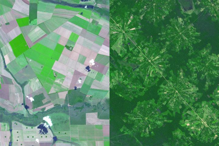
LEFT: LARGE FARMS IN THE CERRADO OF SOUTHERN BRAZIL. RIGHT: PLANNED SETTLEMENT SCHEME IN SANTA CRUZ, BOLIVIA. SOURCE: NASA
But while my team at McGill uses satellite data, we are not the experts. This is where Prof. Friedl and his team come in. They run complex models, using data from the MODIS instrument on board the Terra and Aqua satellites, to map the world’s land cover, whether they are forests, grasslands, urban areas, or croplands. The image below shows the land cover map for South America developed by Prof. Friedl’s team.
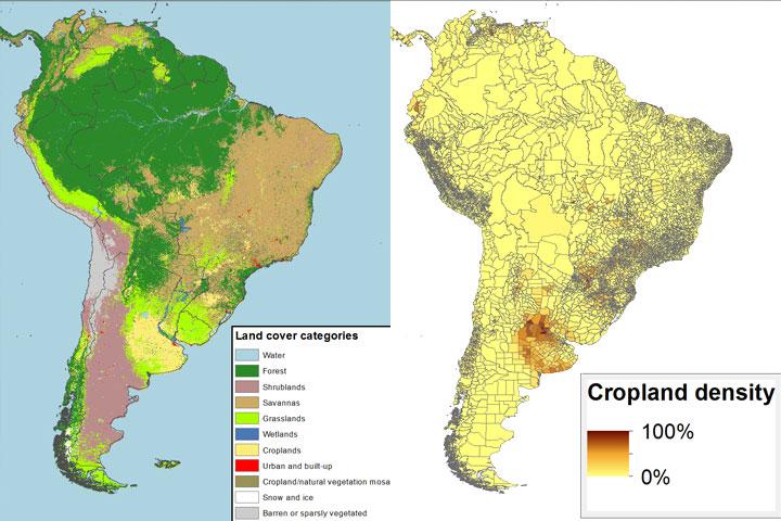
left: MODIS satellite derived land cover. source: nasa / right: Census derived cropland density source: mcgill
It’s wonderful to have satellites that continuously and consistently monitor the Earth’s changing land surface. But the satellites carrying the MODIS instrument are flying 700 km above the Earth. There is not so much MODIS can see of our planet’s land from that distance, through clouds, dust, gases and pollutants. The main scientific contribution of my research team has been to add an additional source of information – data collected from the ground using censuses and surveys.
For the CCAFS project, we obtained data on the total area of cropland or pasture for different countries of the world, broken down by various administrative units within the countries. For South America, we have data for over 7000 administrative units, as seen in the above image. Visually comparing the satellite and census-derived images, one can see the broad correspondence on where croplands are located in South America. However, the devil’s in the details, as we shall see.
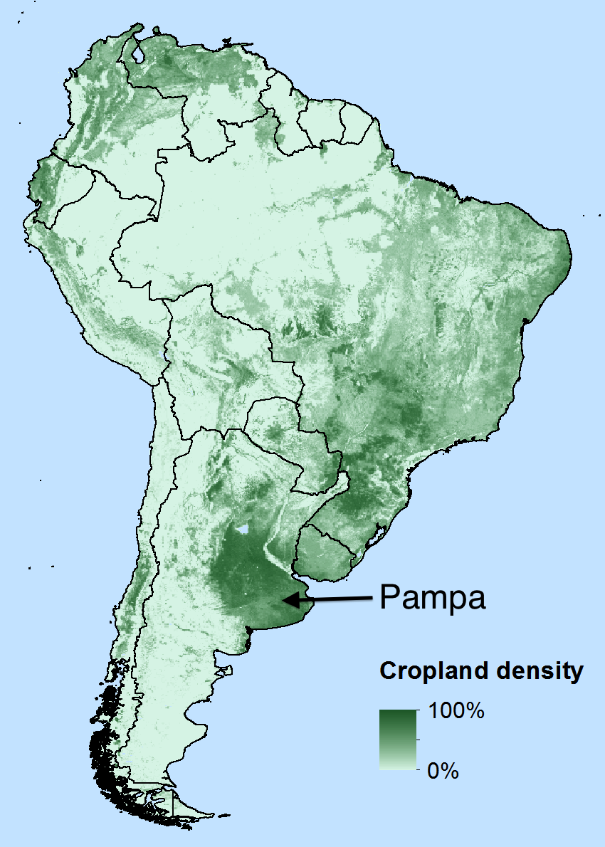
We have developed statistical methods to merge the satellite land cover data and the census data. Essentially, we are using the census data to better interpret the satellite data. The first cropland map we created using this method is shown to the right. It intended to accurately capture the broad patterns of cultivation, from the grain belt of the Argentine Pampa, stretching north into Uruguay and southern Brazil, and along the Andes.
However, we were not happy with some of the details. Let’s zoom in to the heart of South American agriculture, the Pampa in Argentina. The census data shows a distinct “C” shaped pattern, while our map is a poor cousin! Our first question was whether the ‘C shaped’ cropland pattern seen in the census was real. A visual tour of the region using high-resolution Google Earth images confirmed that the “hole” in the C is grazing land, and not cultivated.
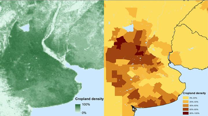
left: Croplands of the Pampa from 1st map
right: Census map of croplands over the Pampa
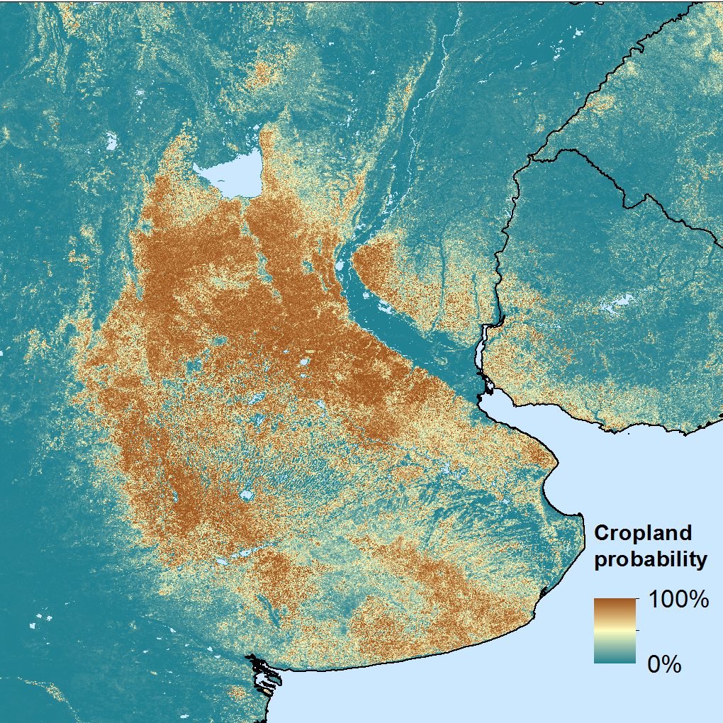 We are now digging deeper into the MODIS data to see if we can improve our map. Until now we have been using already classified ‘land cover’ data from the satellite. However, the algorithm used to create this data generates probabilities for the various land cover classes. The adjoining image over the Pampa shows the probability that a pixel is cropland. Voila! We have the classic ‘C shape’ we are looking for!
This has been a major breakthrough for my research team and we are now building a more generalized statistical model to use the probability layers to improve our map. Stay tuned for our continuing progress on this front.
My first paper on mapping global croplands was published in 1998. One of my proudest moments was when it was published as a pull-out map in National Geographic’s 2002 issue on the “State of the Planet”. But more than a decade later, this is still work in progress. That’s what science is like.
One of my colleagues said that a scientific project is never completed, just abandoned. We will likely soon “abandon” this project also and document it in a journal article so other scientists can understand how we did our work and access our latest data, but we will continue working with colleagues around the world to improve our understanding of global agriculture.
Underlying this work is the hope that such improved information on where and how we grow our food can help better feed the 800 million undernourished people on our planet today and the additional 2-3 billion to be added within the next 40 years.